Not all of my coached athletes are into the data captured as part of their workouts, but I still do a summary data analysis for them all. I think looking back on the ‘hard facts’ of a season, can be quite illuminating.
Some of the data analysis that I do, is simply summarizing the amount of work the athlete has actually put in during the year. Charts showing total hours of training by each sport are often interesting. It is easy to look at the overview and get a flavor for where a lot of effort was put in, or maybe not put in.
The charts produced by Training Peaks compare actually hours of training completed, versus what was planned. Areas of skipped or missed workouts can be seen, and also times when more work was done than planned. You can see peaks and valleys of time dedicated to training, often coinciding with important races or times when an athlete was injured.
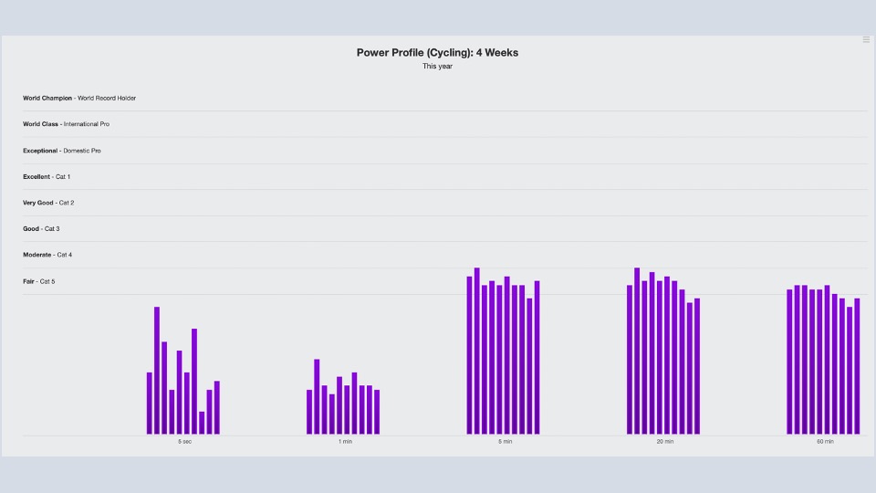
The data analysis that I do, also looks at things like paces on the run or power on the bike. We can compare periods of time, to see improvements from a focused training block. An athlete’s cycling power profile is good to review. You can see my profile as an example above. It clearly shows that I am stronger at endurance efforts and that I am clearly not a sprinter. You can also see that my power has declined slightly as the year progressed. Not surprising, as I have not focused on cycling since Musselman in July.
As you can see, athletes don’t have to be ‘into the data’, to gain some value from these reviews. I also really enjoy putting them together and talking through the summaries with my athletes.


